Design Tips
7 Common Mistakes When Designing Custom Business Shirts (and How to Avoid Them)
The Rise & Tide Team · October 15, 2026 · 7 min read
A good business shirt should make your team recognizable without making anyone work to understand the design. Getting there rarely requires more graphics. It requires a few deliberate decisions about the artwork, the garment, and the people wearing it.
Whether you’re outfitting a landscaping crew, a café counter, or a neighborhood shop, these seven mistakes are worth catching before production. Each has a practical fix that can save confusion and help your shirts earn a place in the daily rotation.
1. Starting with blurry artwork
A logo copied from a social profile may look sharp on your phone but fall apart when enlarged. Raster files, such as PNG and JPEG, are grids of pixels; increasing their dimensions does not restore missing detail. Vector artwork describes shapes mathematically, making it useful for scaling clean logos. SVG, EPS, and some PDF files can contain vectors, but an extension alone does not prove the artwork is vector-based.
The fix: ask your designer for the original artwork and share the intended decoration size. If raster artwork is appropriate, supply the highest-quality original rather than a screenshot. A transparent PNG can suit some workflows; a JPEG cannot preserve transparency. Ask your apparel partner which formats and effective resolution the chosen process needs. There is no single DPI requirement that guarantees every design will print well.
2. Packing in tiny text and fine detail
A shirt is not a business card. A trades company’s logo, service list, phone number, web address, and slogan can become an unreadable cluster when squeezed onto the chest. Thin outlines and small gaps may also lose definition during decoration, especially when translating intricate artwork into embroidery.
The fix: choose a hierarchy. Make the business name or main symbol the first thing someone notices, then keep supporting information selective. View a paper printout at the proposed physical size and normal conversational distance. A layout that works across a back may need a simplified chest version. Have your decorator review small lettering and linework for the actual technique instead of relying on a universal minimum text size.
3. Choosing colors without the shirt
A dark green landscaping logo can disappear on a charcoal tee even though it looks excellent on white stationery. Similar brightness matters as much as different hues. Heathered fabric and the garment’s texture can also change how clearly an edge reads.
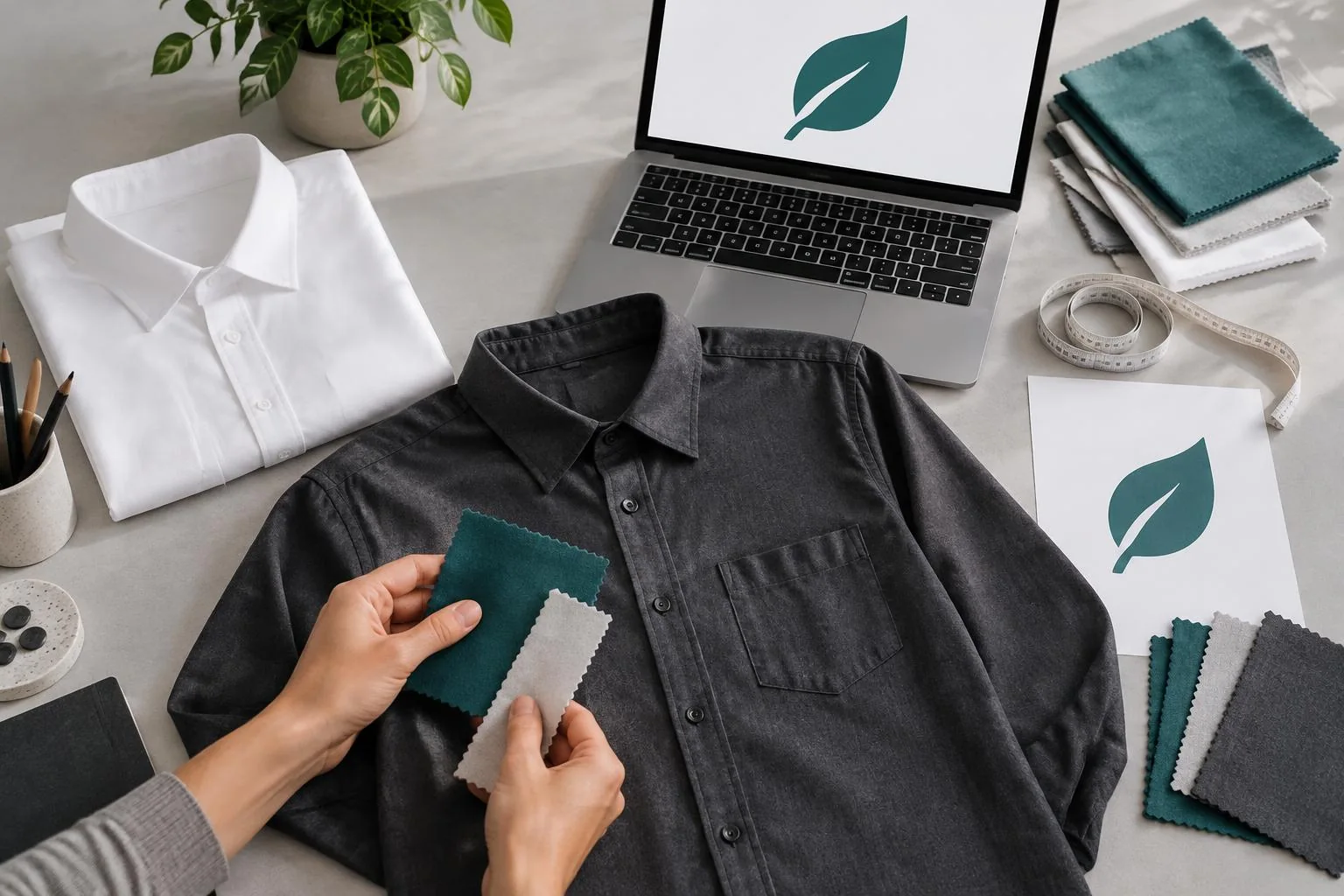
The fix: review the artwork against the exact garment color, not just a white screen. Try a light or dark alternate logo, a simplified outline, or a different shirt color where needed. For a café with a pale cream identity, a contrasting garment may do more than adding extra graphic elements. Ask how ink, underbases, or thread affect the result; a screen preview is not a precise physical color match.
4. Treating placement and scale as afterthoughts
A logo can be too large for a chest, too low on a back, or crowded by a sleeve seam. Pockets, buttons, collars, and apron straps may compete with it. A local shop’s understated chest mark and an outdoor crew’s back design serve different viewing distances and should not automatically use the same layout.
The fix: specify each location and its proposed dimensions in the proof. Check a mockup on the chosen garment and ask about workable decoration areas. Consider whether one artwork size suits the full garment size range or needs an adjustment. Confirm sleeve orientation and spacing around seams. If visibility from behind matters, keep the back design clear without assuming every location needs a separate graphic.
5. Separating decoration from fabric and comfort
The same graphic can feel different depending on the fabric and method. DTF uses a bonded transfer layer; a large solid area can feel less breathable than a smaller, open design. DTG often suits cotton-rich garments, but print feel and results depend on the shirt, pretreatment, and ink coverage. Embroidery adds stitched texture and needs artwork prepared for stitches rather than merely resized for print.
The fix: discuss working conditions before choosing decoration. A landscaper bending and moving in heat may prefer restrained coverage on a suitable shirt. A café polo might suit a compact embroidered mark if the fabric supports it. Ask about heat sensitivity, coatings, and polyester dye migration where relevant. Compare a decorated sample if available; no method automatically guarantees comfort or durability on every garment.
6. Guessing sizes and fit
Ordering everyone’s usual size without checking the actual shirt can leave you with garments nobody enjoys wearing. Different brands and cuts do not fit identically. A close-fitting retail tee may not suit a contractor who needs room to reach, layer, and move.
The fix: collect each person’s size using the selected garment’s chart and, where practical, a try-on sample. Check whether the chart gives body or garment measurements. Ask about the available cuts and size range, and review care instructions. A digital artwork proof cannot tell you how a shirt fits. Confirm exchange terms before decorating; custom garments may not be exchangeable simply because a wearer chose the wrong size.
7. Rushing proof and order approval
Familiarity makes mistakes easy to miss. An old phone number, misspelled name, wrong sleeve, or outdated logo can survive several casual reviews. An attractive mockup also does not confirm the garment model, size quantities, or delivery details.
The fix: have someone who did not prepare the artwork review it. Check spelling, numbers, placement, dimensions, garment color, and the intended decoration method. Reconcile the size breakdown with the total quantity, confirm the deadline and delivery address, and approve the final version explicitly. Save the approved proof and order specification together so a later reorder has a dependable reference.
A concise pre-order checklist
- Supply original artwork and confirm the accepted file format.
- Check readability, contrast, placement, and dimensions on the chosen shirt.
- Confirm fabric, decoration compatibility, fit, and sample options.
- Collect sizes and reconcile them with the order quantity.
- Review spelling and order details, then save the final approval.
Keep planning with these related Journal guides:
At Rise & Tide, we’d rather work through these decisions with you than decorate a shirt that misses the point. Bring your artwork, team needs, and timeline, and start with a clear, practical specification.
Ready to put the right shirts to work? Explore business packages for a starting point, or request a custom quote for your design and quantity.
Every Brand Has a Story. Every Shirt Tells One.